Colour is a powerful tool in interior design. It sets the mood, creates harmony, and enhances the aesthetic appeal of any space.
In Australia, where we are blessed with unique and diverse landscapes, colour can help connect the indoors with the outdoors.
But creating a cohesive colour palette for interior design can be a daunting task.
This article will guide you through the process, providing insights into colour theory, the psychological effects of colours, the creation of a colour palette, and the application of colours in your space.
Let’s dive in!

Understanding the Basics of Colour Theory
Colour theory is a fundamental concept in design and crucial to creating a balanced colour palette. It explains how colours work together and how they can be combined to create different effects.
A solid understanding of colour theory can aid in choosing the right colours for your interior design project.
Primary, Secondary, and Tertiary Colours
Colours are categorised into primary, secondary, and tertiary. The primary colours are red, blue, and yellow.
When you mix primary colours, you get secondary colours, namely green, orange, and violet. Tertiary colours are created by combining a primary colour with a secondary one.
Recognising these groups is the first step in creating a harmonious colour scheme.
Warm and Cool Colours
Colours are also classified as warm or cool.
Warm colours, like red, orange, and yellow, evoke feelings of warmth and comfort, while cool colours, such as blue, green, and violet, give a sense of calm and serenity.
Balancing warm and cool colours in your interior can help create a visually pleasing atmosphere.

The Colour Wheel and Its Significance
The colour wheel is a helpful tool for understanding the relationship between colours. It displays colours in a circular format, with primary, secondary, and tertiary colours arranged in a particular sequence.
Using the colour wheel can guide you in picking complementary, analogous, or triadic colour schemes for your interior design project.
How Colours Influence Mood and Atmosphere
Colours have the power to evoke emotions and affect our moods. Therefore, your choice of colours can significantly influence the atmosphere of your interior space.
Let’s explore how to choose the right colours to create the desired effect.
The Psychological Impact of Colours
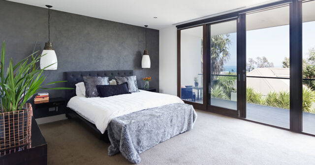
Different colours can evoke different psychological responses. For instance, blue often induces calmness and relaxation, making it a popular choice for bedrooms.
On the other hand, red can stimulate appetite, making it suitable for dining areas.
Understanding the psychological impact of colours can guide you in creating an interior that suits your desired mood and function.

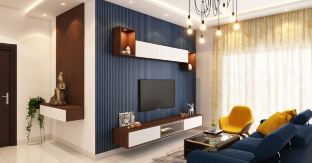
Choosing the Right Colours for Your Space
When choosing colours, consider the purpose of the space. For instance, for a tranquil and relaxing environment, such as a bedroom, you might opt for cooler colours.
In contrast, lively and warm colours may be suitable for social spaces like the living room. Remember, your colour choice should support the function and feel of the space.
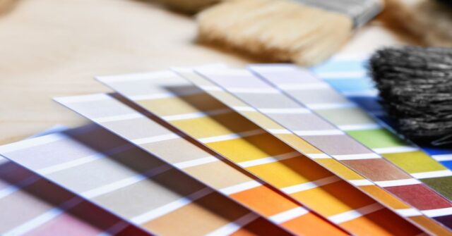
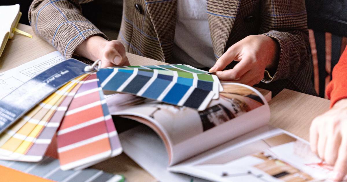
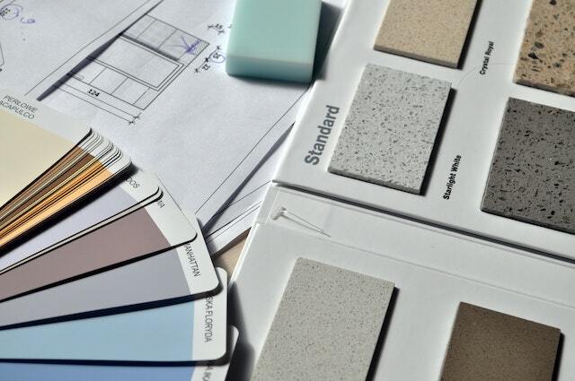
Creating Your Colour Palette
With a solid understanding of colour theory and the psychological impact of colours, it’s time to create your colour palette.
This will serve as your guide when selecting paints, furnishings, and accessories for your interior design project. Let’s explore the different colour schemes you can consider.
Using a Monochromatic Colour Scheme
A monochromatic colour scheme involves using different tints, shades, and tones of a single colour. This scheme creates a harmonious and unified look, offering a sense of balance and simplicity.
It’s an excellent choice if you’re aiming for a minimalist, modern aesthetic.
Opting for an Analogous Colour Scheme
An analogous colour scheme consists of colours that are next to each other on the colour wheel.
This scheme provides more variety than the monochromatic scheme while maintaining harmony in your design.
An analogous scheme can be a great option if you want to create a warm, welcoming atmosphere.
Choosing a Complementary Colour Scheme
A complementary colour scheme involves using colours opposite each other on the colour wheel, such as red and green, or blue and orange.
This scheme creates a vibrant and high-contrast look, adding dynamism to your space. It’s ideal for highlighting key elements in your room.
Exploring a Triadic Colour Scheme
A triadic colour scheme includes three colours evenly spaced on the colour wheel. It offers a balanced yet colourful look.
When using a triadic scheme, one colour should dominate, while the other two serve as accents. This scheme can be a great choice if you’re aiming for a lively and exciting interior.
Considering Australian Light and Landscape
In Australian interior design, it’s crucial to consider the unique natural light and diverse landscapes. The light in Australia can be very bright and intense, affecting how colours appear.
Moreover, incorporating the natural colours of Australian landscapes can help establish a connection between the indoors and outdoors.
Understanding Australia’s Unique Natural Light
Australia’s natural light is unique and intense, with a high UV level that can make colours appear brighter.
Therefore, when selecting colours, consider how they will look under Australia’s natural light. For instance, you might opt for softer and lighter hues to counteract the intense light.
Incorporating Natural Colours of Australian Landscapes
Australia’s diverse landscapes offer a beautiful palette of colours, from the red outback to the blue coastline, to the green rainforest.
Incorporating these colours in your interior can create a sense of continuity with the outside environment, enhancing the feeling of spaciousness and openness.
Applying Your Colour Palette to Your Space
With your colour palette ready, it’s time to apply it to your space. This involves integrating the colours in your walls, furniture, and decor, as well as highlighting architectural features.
Here are some tips on how to distribute colours throughout your space.
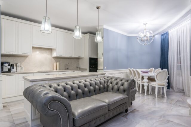
Colour Distribution: The 60-30-10 Rule
When applying colours to your space, a good rule of thumb is the 60-30-10 rule. Here, 60% of the space uses the dominant colour, 30% uses the secondary colour, and 10% uses the accent colour.
This distribution creates a balanced and visually pleasing look.
Integrating Colours in Furniture and Decor
Your furniture and decor are excellent avenues to introduce your colour palette into your space.
For instance, a neutral-coloured room can be enlivened with colourful furniture and decor. Remember, every element in your room contributes to the overall colour scheme.
Using Colour to Highlight Architectural Features
Colour can be used to highlight architectural features, such as a fireplace or built-in shelves. By painting these features a contrasting colour, you can draw attention to them and make them stand out.
This strategy can add visual interest to your space and enhance its unique features.
Common Mistakes to Avoid When Choosing Colours
While choosing colours can be exciting, it’s also easy to make mistakes. Here are some common pitfalls to avoid when selecting your colour palette.
Ignoring the Impact of Lighting
Lighting significantly affects how colours appear. A colour that looks great in the store might look different under your home’s lighting conditions.
Therefore, before finalising your colours, test them under different lighting conditions to ensure they look as expected.
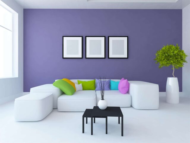
Overdoing Colour Usage
While it’s exciting to play with colours, overdoing it can result in a chaotic and overwhelming look. Remember, balance is key in design.
Make sure to balance your bright, vibrant colours with some neutral tones to create a harmonious look.
Neglecting Neutrals
Neutrals play a crucial role in design. They provide a backdrop against which your chosen colours can stand out. Neglecting neutrals can result in a lack of contrast and depth.
Therefore, include some white, beige, or grey in your colour scheme to create balance.
Colour Trends in Australian Interior Design
While it’s crucial to choose colours that you love, it’s also helpful to know the current trends in Australian interior design. Keeping abreast with these trends can give you fresh ideas and inspirations.
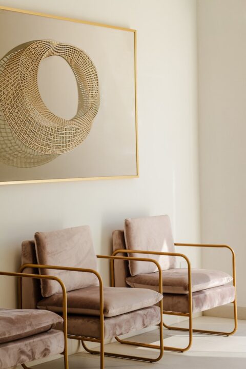
Embracing Earthy Tones and Native Textures
Earthy tones and native textures are currently popular in Australian interior design. These colours, inspired by Australia’s diverse landscapes, create a warm and inviting look.
Combining these colours with native textures can further enhance the connection with the outdoors.
The Rise of Bold and Saturated Colours
Bold and saturated colours are making a comeback. These colours can make a statement and add personality to your space. They’re perfect for accent walls, statement furniture, or dramatic accessories.
Conclusion: Building a Cohesive Interior Design
Building a cohesive interior design involves more than just choosing a set of colours.
It requires thoughtful consideration of colour theory, the mood you want to create, the unique Australian light and landscapes, and the application of your colour palette in your space.
Remember, balance and harmony are key, and don’t be afraid to experiment and make the space truly your own.
Maintaining Balance and Harmony
Maintaining balance and harmony in your space is key to a successful design. This involves not only balancing colours but also textures, patterns, and materials.
Keep the 60-30-10 rule in mind, and don’t forget to include neutrals to provide a restful backdrop for your colours.
Being Open to Experimentation
Lastly, be open to experimentation. While guidelines and theories can guide you, don’t be afraid to break the rules and trust your instincts.
After all, it’s your space, and it should reflect your personal taste and style. Enjoy the process and have fun!