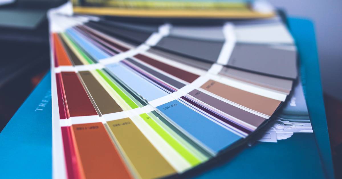
Colours are an essential part of our daily lives. They influence our moods, actions, and even our decisions.
Understanding the psychology of colours can help us create spaces that improve our mood, productivity, and overall well-being.
This article aims to shed light on the fascinating world of colour psychology and how it impacts our living and working spaces.
Introduction to Colour Psychology
Colour psychology is the study of how colours influence human behaviour and mood.
It is an interesting field of psychology that has been gaining prominence over the years due to its relevance in various sectors such as marketing, interior design, and mental health.
Understanding Colour Psychology
At its core, colour psychology is about understanding how colours affect our perception and behaviour.
Every colour, whether it’s the calming blue of the ocean or the energetic red of a fire engine, triggers certain emotions and thoughts in us.
This influence can be subtle or overt, but it invariably impacts our mood and mental state.
History of Colour Psychology
The study of colour and its impact on human behaviour dates back to ancient times.
Ancient Egyptians used colours for their healing properties, while philosophers like Plato and Aristotle pondered the meaning of different colours.
Modern colour psychology has its roots in the early 19th century when researchers started studying the effects of colours on human emotions and moods.
Primary Colours and Their Psychological Effects
The primary colours, red, blue, and yellow, are the building blocks of all other colours.
As such, they carry strong psychological implications and are often used strategically in various aspects of our lives, such as marketing, branding, and interior design.
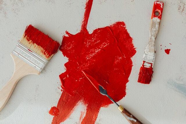
Red: Energy and Passion
Red is a powerful colour. It is associated with energy, passion, and excitement. It has the capacity to stimulate a space and create a vibrant atmosphere.
However, overuse of red can also cause agitation and stress.
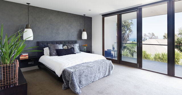
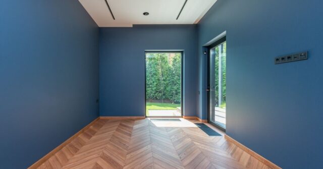
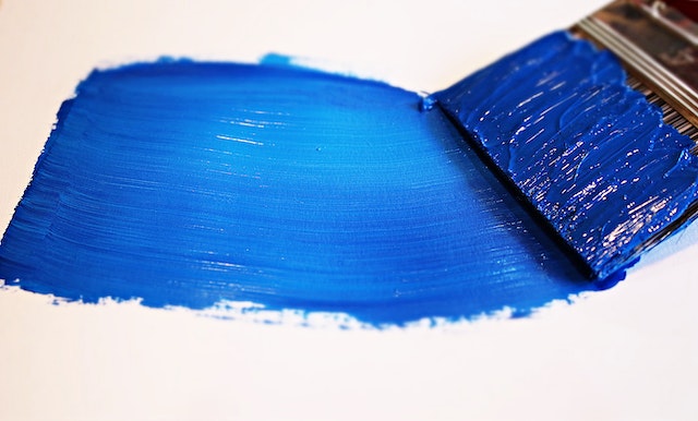
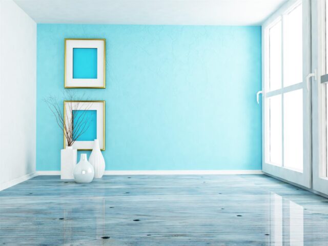
Blue: Calmness and Productivity
Blue, on the other hand, is often associated with calmness, stability, and peace. It’s a colour that can help reduce stress and create a relaxed environment.
It’s also linked to productivity, which makes it an excellent choice for workspaces.
Yellow: Happiness and Creativity
Yellow is the colour of sunshine and is associated with joy, happiness, and energy. It’s known to stimulate creativity, making it a great colour for spaces that require brainstorming and problem-solving.
However, too much yellow can be overwhelming and may lead to anxiety.

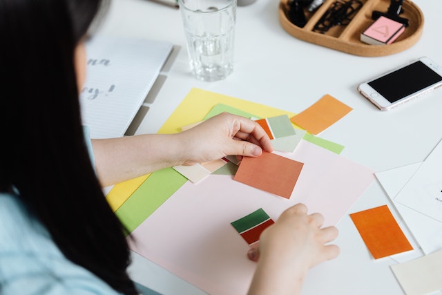
Secondary and Tertiary Colours and Their Psychological Effects
Beyond primary colours, there is a spectrum of secondary and tertiary colours, each with unique psychological implications.
They can have a powerful impact on our emotions and behaviours, making it essential to understand them in the context of our living and working spaces.
Green: Balance and Harmony
Green is the colour of nature, symbolising balance, growth, and harmony. It’s a calming colour that can foster a sense of tranquillity and well-being.
Its association with the environment makes it an excellent choice for creating a relaxed and peaceful space.
Orange: Enthusiasm and Excitement
Orange, a blend of red’s passion and yellow’s joy is a vibrant and enthusiastic colour. It can bring a sense of energy and excitement to a space.
It’s particularly useful for areas where high energy and creativity are needed.

Purple: Luxury and Ambition
Purple, a blend of the calm stability of blue and the fierce energy of red, is traditionally associated with luxury, power, and ambition.
It can create a sense of richness and depth in a space. Lighter shades of purple, like lavender, can bring a restful quality to bedrooms or lounges.
Pink: Love and Kindness
Pink, often associated with love, kindness, and femininity, can bring a soft, calming sensation to a space.
Depending on its shade, pink can range from a playful, youthful colour to a sophisticated and modern hue.
Black: Power and Mystery
Black is a colour of power, elegance, and mystery. In interior design, it can bring depth and sophistication.
However, excessive use of black can make a space feel heavy and oppressive, so it’s often used sparingly and paired with lighter colours.
White: Purity and Simplicity
White represents purity, cleanliness, and simplicity. It provides a feeling of freshness and openness in a space. As it reflects light well, it can help to make a room feel larger and brighter.
Grey: Neutrality and Sophistication
Grey is a neutral and balanced colour, often associated with sophistication and modernity. It’s versatile and can work well with many other colours to create a stylish and contemporary space.
Brown: Stability and Comfort
Brown, the colour of the earth, is associated with stability, reliability, and comfort. It’s a warm neutral that can make a space feel cosy and inviting.
It works well in living rooms and bedrooms, creating a sense of warmth and security.
Colour Psychology in Different Spaces
Now that we understand the psychological implications of various colours, let’s examine how they can be strategically employed in different spaces to achieve desired moods and effects.
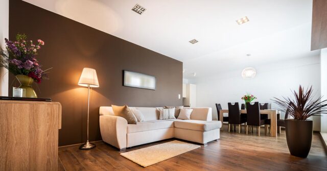
In the Home
In residential spaces, colour can be used to create environments that nurture comfort.
Living rooms could benefit from the energy of oranges or reds, while bedrooms might be more relaxing with blues and greens. In kitchens, yellow might stimulate appetite and encourage a social atmosphere.
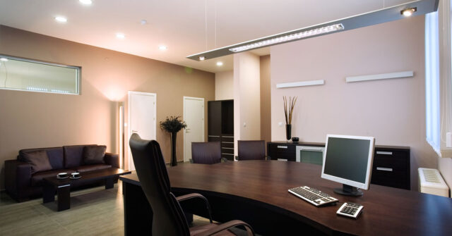
At the Workplace
In workspaces, colour psychology can be used to improve productivity and morale. Blues are often used in office spaces for their calming and focusing effects.
Creative spaces might use splashes of yellow to inspire innovation and creativity. Red could be used in detail-oriented spaces where high energy is required.
In Public Spaces
In public spaces like restaurants, retail shops, and hospitals, colour can influence behaviour and perceptions.
Reds and yellows might be used in fast-food restaurants to stimulate appetite and a sense of urgency. Hospitals often use blues and greens for their calming effects.
The Role of Cultural Perception in Colour Psychology
It’s important to remember that the psychology of colour isn’t universal – it can be influenced significantly by cultural context and personal experiences.
Colour Symbolism in Australia
In Australia, colour symbolism often aligns with Western colour associations. Green and gold, the national colours, carry a sense of pride and unity.
Blue, found in abundance on the Australian coastlines, is often associated with calmness, trust, and dependability.
Colour Preferences Across Different Cultures
Different cultures have diverse perceptions and interpretations of colour. For instance, while white is associated with purity in many Western cultures, it is often linked to mourning in some Eastern cultures.
Recognising these cultural nuances is important when applying colour psychology, particularly in multicultural environments.
How to Use Colour Psychology to Enhance Your Mood and Well-being
Knowing how colours can influence mood and behaviour, we can harness this knowledge to create environments that support our mental and emotional well-being.
Choosing the Right Colours for Your Living Space
When it comes to your home, consider how you want to feel in each space. Do you want your bedroom to be a peaceful sanctuary? Consider blues or greens.
Do you want an energising home office? Try incorporating some yellow.
Employing Colour in Office Spaces
For workplaces, consider the type of work being done. Use colours that support the tasks at hand – for instance, blues for work requiring focus, or reds for spaces that need to be energetic and dynamic.
The Role of Colour in Branding and Marketing
In the world of branding and marketing, colour plays a vital role in shaping consumer perceptions and behaviours. A well-chosen colour can convey a brand’s identity and values without saying a word.
Australian Brands and Their Use of Colour
Australian brands often utilise colour to communicate their brand story. For example, the use of green in Woolworths’ branding suggests freshness and natural quality, aligning with their focus on fresh food.
The iconic yellow of the Commonwealth Bank signifies optimism and positivity.
Conclusion: The Impact of Colour Psychology on Our Lives
Colour psychology is a fascinating field with powerful implications for our daily lives.
By understanding the effect of colours on our mood and behaviour, we can choose colours to create spaces that nurture our well-being, enhance productivity, and foster positive interactions.
So the next time you’re thinking of repainting your home or office, remember – colour is more than just aesthetics; it’s a powerful psychological tool.