Choosing the right interior paint colour sounds simple. Until you’re standing in front of a wall of sample swatches, wondering why every white looks the same.
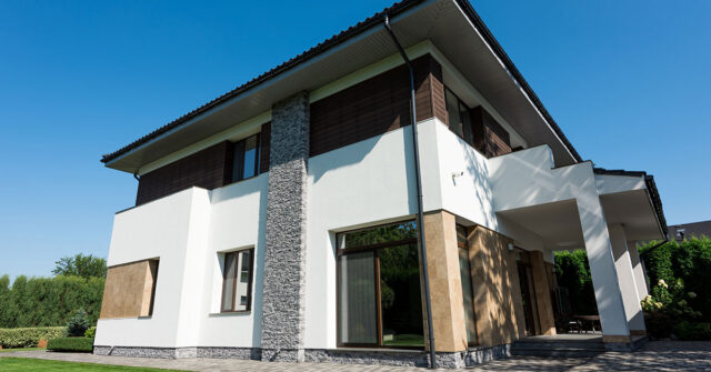
In reality, colour behaves differently in every home. Sydney’s natural light, your flooring, and even the direction your windows face can completely change how a paint colour appears. This guide walks you through what’s working in Sydney homes right now and how to choose colours you’ll still be happy with years from now.
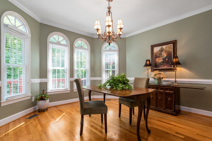
What Colours Are Trending in Sydney Homes Right Now?
Interior colour trends in Sydney have shifted in recent years.
Cool greys that once dominated modern homes are being replaced with warmer, more natural tones. Many homeowners now prefer colours that feel comfortable and timeless rather than stark or overly polished.
Current trends include:
- Soft, warm whites instead of bright whites
- Earthy neutrals like beige, greige, and taupe
- Nature-inspired shades such as sage green and muted blues
Preferences often vary by home type:
- Coastal homes lean toward light, airy palettes
- Inner-city apartments favour soft neutrals with contrast
- Heritage homes suit warmer, classic tones
Trends are a useful guide, but they only go so far. The right colour is the one that works with your space.

Most Popular Interior Paint Colour Categories
Most Sydney homes use a combination of colours rather than relying on just one. A balanced palette helps create flow and keeps the space feeling cohesive.
Here are the colour groups used most often.
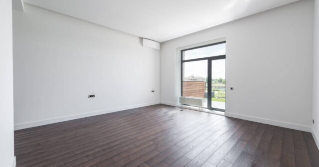
Crisp Whites and Soft Off-Whites
White remains the most popular interior choice. It’s clean, versatile, and suits almost any style of home.
The difference comes down to undertones:
- Cool whites can feel sharp or slightly blue
- Warm whites feel softer and more inviting
In Sydney homes, softer whites tend to work better, especially in living areas where warmth matters.
Common options include:
- Dulux Lexicon Quarter
- Dulux Natural White
It’s worth remembering that white isn’t neutral in every setting. It can shift noticeably depending on light and surrounding finishes, so always test it alongside trims and ceilings.
Warm Neutrals and Greige Tones
Warm neutrals have become a reliable alternative to plain white.
Sitting between beige and grey, greige tones offer a balanced look that works across different spaces. They’re popular because they:
- Add warmth without feeling dated
- Suit both modern and traditional interiors
- Appeal to a broad range of buyers
If you’re unsure where to start, this is often the safest option.
Soft Greys (Still Relevant, But Evolving)
Grey is still used, but in a softer, more refined way.
Instead of cool, blue-based greys, homeowners are choosing warmer, muted variations that feel more relaxed.
The main risk is a mismatch. If the undertone clashes with flooring or cabinetry, the result can feel disjointed.
A simple approach is to pair grey tones with warm materials like timber to keep the space balanced.
Earthy Tones (Beige, Taupe, Clay)
Earthy tones are gaining popularity across Sydney interiors.
Colours like taupe, clay, and soft beige bring depth without overwhelming the space. They work particularly well in homes that feature natural materials such as timber or stone.
These tones suit:
- Open-plan living areas
- Homes with strong indoor-outdoor connections
- Spaces where a relaxed, grounded feel is preferred
They add character while still remaining easy to live with.
Statement Colours (Greens, Blues, Feature Walls)
For those wanting more personality, statement colours are being used more confidently.
Popular choices include:
- Sage green for a calm, natural feel
- Deep navy for contrast
- Charcoal for modern accents
These colours are often used in:
- Bedrooms
- Home offices
- Feature walls
Some homeowners are also embracing full-room colour for a more immersive look. When balanced with neutral elements, it can feel cohesive rather than overwhelming.
How To Choose The Right Colour For Your Home
Choosing a colour isn’t just about what looks good on a sample card. It’s about how it works in your space.
Consider Natural Light
Light has the biggest impact on colour.
Sydney’s strong daylight can wash out tones, making them appear lighter than expected. South-facing rooms often feel cooler, while north-facing spaces bring out warmth.
It’s also important to check colours at night. Artificial lighting can shift the way a colour looks quite noticeably.
Think About Room Size and Function
Colour influences how a room feels.
- Lighter colours can make smaller spaces feel more open
- Darker tones can add depth and make larger rooms feel more intimate
Ceiling height also plays a role. Lighter ceilings can create a sense of space, while darker tones bring the room in slightly.
Create Flow Between Rooms
A lack of flow is a common issue in many homes.
Instead of choosing completely different colours for each room, it helps to:
- Use one base colour throughout
- Introduce subtle variations in tone
This approach keeps the home feeling connected rather than fragmented.
Match Existing Finishes
Paint needs to work with what’s already in the home.
Consider:
- Flooring
- Cabinetry
- Tiles
- Fixtures
Pay close attention to undertones. A mismatch, even if subtle, can throw off the entire space.
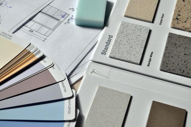
Test Before You Commit
This step is often overlooked, but it makes a significant difference.
Always:
- Paint sample patches directly on your walls
- Test them in multiple spots
- Check them at different times of day
A colour that looks perfect in-store can feel completely different once it’s on your walls.
Popular Paint Colours for Different Rooms
Different rooms have different requirements. A colour that works in one space may not suit another.
Living Rooms
Living rooms benefit from flexible, neutral palettes.
Soft whites, warm neutrals, and light greiges are popular because they reflect light well and adapt easily to changing furniture and décor.
Bedrooms
Bedrooms are best suited to softer, more calming tones.
Warm neutrals and muted greens or blues create a relaxed environment without feeling dull.

Kitchens
Kitchens typically lean toward clean, simple colours.
Whites and soft neutrals are common, often paired with cabinetry to create contrast while maintaining a fresh, cohesive look.
Hallways and Small Spaces
Hallways and smaller areas benefit from light-reflective colours.
Keeping these spaces aligned with adjoining rooms helps avoid visual breaks and makes the home feel more open overall.
Common Mistakes When Choosing Interior Paint Colours
Even with good intentions, it’s easy to get caught up.
Common mistakes include:
- Choosing a colour based only on a small swatch
- Ignoring how the lighting changes throughout the day
- Following trends without considering the home’s style
- Skipping proper sample testing
- Overlooking paint finish. Matte, satin, and gloss can all affect how colour appears
Spending a bit more time up front can help avoid costly repainting later.

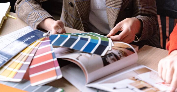
Why Getting Professional Advice Makes a Difference
Paint colour is only part of the final result. How it’s applied matters just as much.
Professional painters understand how colours behave in real homes, not just in showrooms. They also know how proper surface preparation affects the final finish and how to maintain consistency across different areas.
Getting expert advice early can help you avoid common pitfalls and achieve a result that looks right from every angle.
Choosing Colours That Work for Your Space
There’s no single “perfect” paint colour.
The right choice depends on your home, your lighting, and how you want each space to feel. Trends can guide you, but they shouldn’t drive the decision.
Focus on the fundamentals:
- Light
- Undertones
- Flow between rooms
When these elements align, the result feels natural and cohesive.
Get Help Choosing The Right Paint Colours
If you’re unsure where to start, getting a second opinion can make the process much easier.
A professional painter can help you choose colours that suit your home and deliver a finish that lasts. If you’re planning a repaint in Sydney, it’s worth getting expert guidance before you begin.

FAQs
If you’re still weighing up your options, these common questions can help clarify what works best in real homes and how to choose with confidence.
What Are The Most Popular Interior Paint Colours In Australia Right Now?
Warm whites, greige tones, and earthy neutrals are among the most popular choices. They offer flexibility and suit a wide range of home styles.
Are Grey Walls Still In Style?
Yes, but the trend has shifted toward softer, warmer greys. Cool, blue-toned greys are less common than they were in the past.
What Colour Makes A Room Look Bigger And Brighter?
Light colours such as soft whites and pale neutrals reflect more light, helping a room feel more open and spacious.
What Is The Best White Paint For Interiors In Australia?
There isn’t a single best option, but popular choices include Dulux Natural White and Lexicon Quarter. The right choice depends on your lighting and surrounding finishes.
How Do I Choose Between Warm And Cool Paint Colours?
Look at your existing finishes. Warm tones work well with timber and earthy materials, while cool tones suit more modern interiors. Testing samples is the most reliable way to decide.
How Do I Test Paint Colours Properly Before Painting?
Paint large sample patches directly onto your walls and observe them throughout the day. This gives a much clearer idea of how the colour will look in your space.